This is a draft of the A1 sized poster I will be presenting at LCDNets in a few weeks and I’d like some feedback, I’ll be printing tomorrow at 9am
Version 2 (Latest Version)
Version 1 (Original Version)
This is a draft of the A1 sized poster I will be presenting at LCDNets in a few weeks and I’d like some feedback, I’ll be printing tomorrow at 9am
Version 2 (Latest Version)
Version 1 (Original Version)
Top-level comment: Looks nice, clean and tidy, but I need something to direct me to where to start reading otherwise it’s just an unstructured series of statements. Perhaps separate the “Aim” section a bit (different colour background? larger font size?
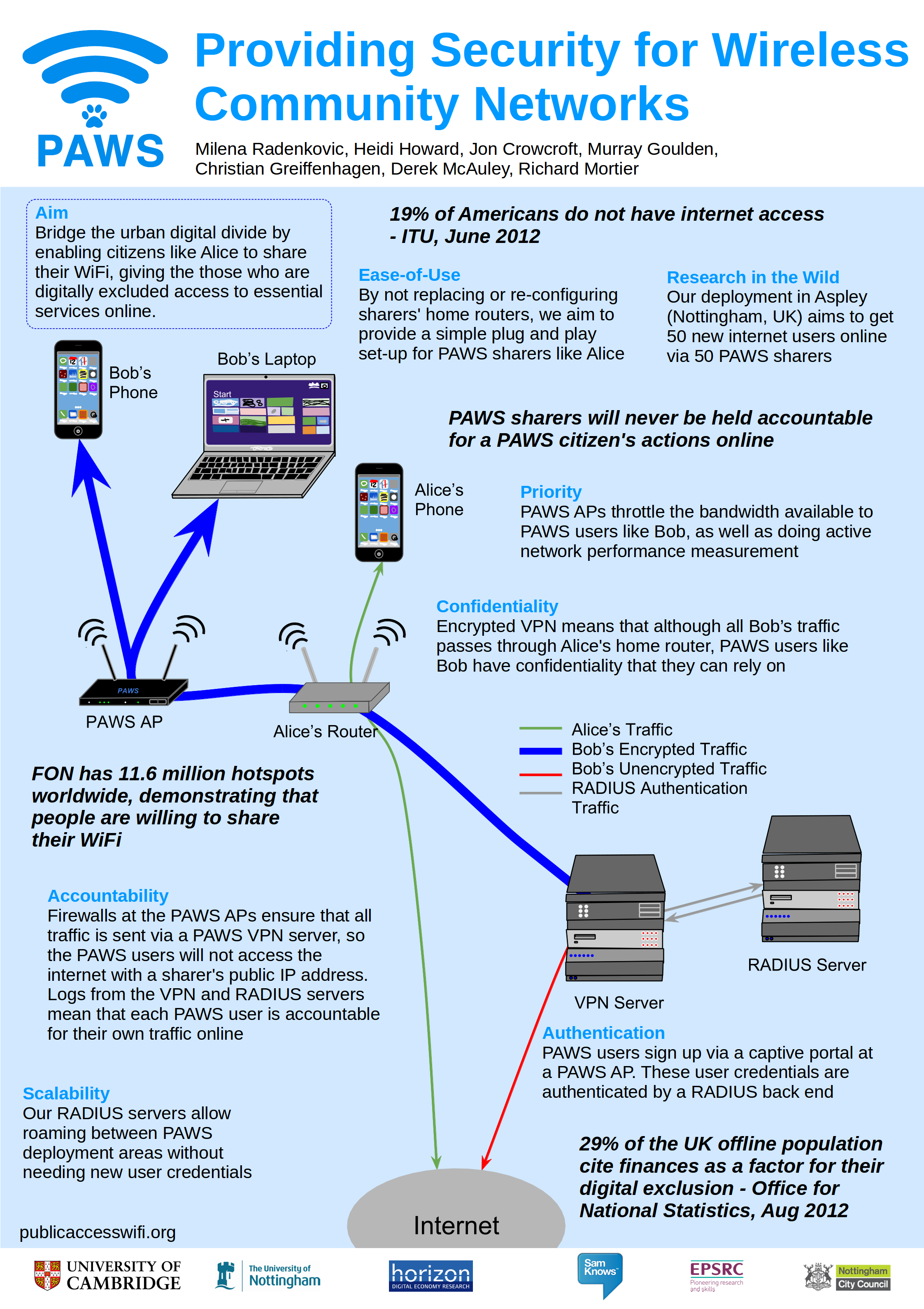
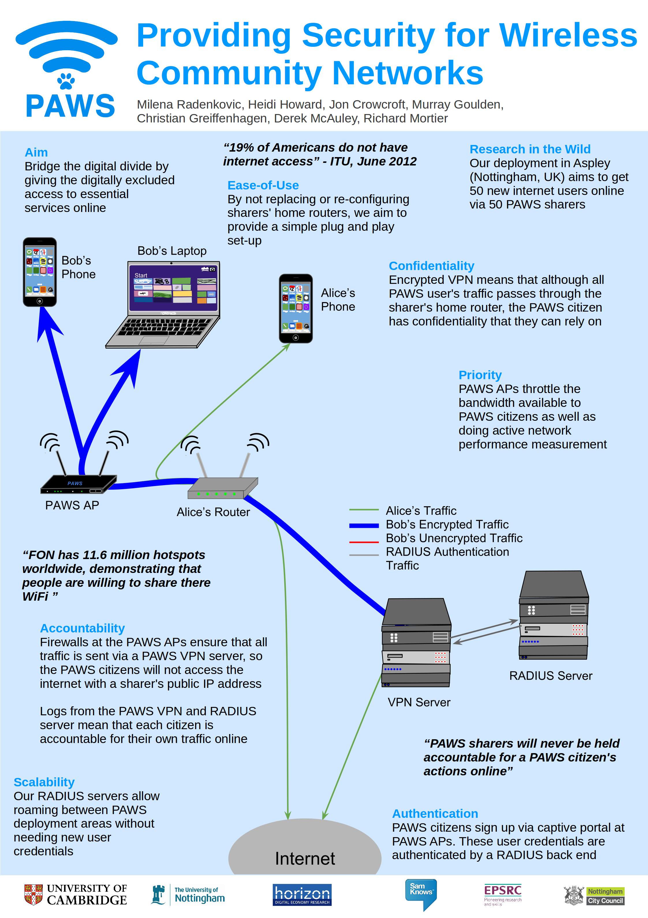
You could also have numbers on your arrows showing the order in which things happen when a connection is created?
Remember that you need to attract people in from a distance. The best way to do this is to have some bits of the poster large enough to be read from a couple of metres away.
Also highlight the “research in the wild” bit. Shout it out – you’re actually doing a real world deployment which is more than can be said for 99.9% of research work.
Could you move the text blocks nearer to the relevant bits of the picture (e.g. Authentication should be near the picture of the RADIUS server). Then use the nice quotations to fill in gaps so there aren’t too many blank spaces.
re-jig the size of the text blobs so that you don’t get single words wrapping onto another line
For quotes perhaps use a different font colour? and make sure they all have an attribution (the FON quote is a key part of the argument, but it has no attribution so I don’t know if it’s real or not).
In the quote about FON change there to their (e.g. “… share their WiFi.”)
Bob doesn’t have any unencrypted traffic. Is this intentional?
Unclear which router Alice’s phone is using. Looks like it’s merging with Bob’s encrypted stuff.