In this post we will be looking at the results for the Azure latency Pilot study described last week. Yesterday, we started by looking at the aggregated results and found that the measured RTT was larger then expected. Today, we will look at how the results vary depending on which VMs the measurements where taken between. It may be the case that we can infer something about topology between VMs, for example whether VM’s are in the same physical host and the same rack.
The table below shows the RTT between each pair of VMs. The first server in the pair, labelled src is the one which initialised the ping. The table includes each machine pinging itself for comparison.
| src | dst | mean | s.d | min | 25th | 50th | 75th | max |
|---|---|---|---|---|---|---|---|---|
| 1 | 1 | 51.0 | 65.1 | 1.7 | 4.3 | 65.25 | 71.6 | 1004.0 |
| 1 | 2 | 12.1 | 89.7 | 1.7 | 2.9 | 3.6 | 4.3 | 1004.7 |
| 1 | 3 | 9.5 | 66.5 | 1.6 | 3.4 | 4.1 | 4.8 | 1004.7 |
| 1 | 4 | 7.3 | 52.3 | 1.3 | 3.0 | 3.5 | 4.0 | 1004.1 |
| 1 | 5 | 11.8 | 84.9 | 1.6 | 3.0 | 3.6 | 4.4 | 1242.2 |
| 2 | 1 | 6.2 | 12.7 | 1.6 | 3.0 | 3.7 | 4.425 | 88.4 |
| 2 | 2 | 16.7 | 65.8 | 1.1 | 3.0 | 3.7 | 4.6 | 1002.9 |
| 2 | 3 | 15.0 | 95.6 | 1.4 | 3.0 | 3.7 | 4.4 | 1004.9 |
| 2 | 4 | 9.6 | 62.0 | 1.4 | 2.9 | 3.5 | 4.3 | 1003.6 |
| 2 | 5 | 15.3 | 80.0 | 1.3 | 2.9 | 3.5 | 4.3 | 1002.5 |
| 3 | 1 | 48.5 | 44.9 | 2.0 | 4.5 | 64.2 | 70.6 | 754.9 |
| 3 | 2 | 7.0 | 48.9 | 1.4 | 2.9 | 3.6 | 4.4 | 1005.0 |
| 3 | 3 | 3.9 | 4.2 | 1.6 | 3.1 | 3.8 | 4.6 | 124.9 |
| 3 | 4 | 5.8 | 32.0 | 1.3 | 2.9 | 3.4 | 4.0 | 628.6 |
| 3 | 5 | 6.7 | 52.5 | 1.5 | 2.9 | 3.8 | 4.4 | 1229.3 |
| 4 | 1 | 48.8 | 48.3 | 1.9 | 4.7 | 62.1 | 67.3 | 1003.0 |
| 4 | 2 | 7.7 | 59.5 | 1.3 | 2.8 | 3.6 | 4.4 | 1003.8 |
| 4 | 3 | 9.0 | 60.1 | 1.6 | 3.3 | 4.1 | 4.8 | 1004.0 |
| 4 | 4 | 5.2 | 29.3 | 1.2 | 2.7 | 3.3 | 3.8 | 754.6 |
| 4 | 5 | 15.6 | 104.7 | 1.5 | 2.8 | 3.6 | 4.3 | 1035.0 |
| 5 | 1 | 50.9 | 69.8 | 2.0 | 4.5 | 63.8 | 69.6 | 1005.3 |
| 5 | 2 | 9.4 | 70.9 | 1.3 | 2.9 | 3.7 | 4.3 | 1003.8 |
| 5 | 3 | 8.6 | 57.6 | 2.0 | 3.3 | 4.1 | 4.8 | 1003.7 |
| 5 | 4 | 6.5 | 47.7 | 1.3 | 2.7 | 3.4 | 4.0 | 1003.0 |
| 5 | 5 | 6.8 | 49.2 | 1.2 | 2.5 | 3.2 | 4.1 | 1023.0 |
All VMs other than VM 2 have high latency to VM 1. In fact, we see an average 65 ms RTT from VM 1 to itself. This warrants further investigation into how hping3 is measuring latency. Removing VM 1 from the equation, we observe reasonable uniformity in the RRTs between VMs 2 to 5. Between these the min, 25th, 50th and 75th percentile are all similar and the maximum varies highly, which is to be expected.
I would like to take a close look at how the distribution of RTT measurements varies between VMs 2 to 5. The table below shows the RTT between each pair of VMs between 2 to 5, at various percentile points.
| src | dst | 80th | 90th | 95th | 98th | 99th |
|---|---|---|---|---|---|---|
| 2 | 2 | 5.1 | 41.8 | 47.2 | 124.6 | 150.7 |
| 2 | 3 | 4.6 | 5.0 | 5.5 | 34.5 | 429.5 |
| 2 | 4 | 4.5 | 4.9 | 5.5 | 47.4 | 78.5 |
| 2 | 5 | 4.5 | 5.4 | 60.4 | 91.8 | 207.8 |
| 3 | 2 | 4.5 | 4.8 | 5.0 | 5.5 | 8.9 |
| 3 | 3 | 4.7 | 5.0 | 5.1 | 5.4 | 5.8 |
| 3 | 4 | 4.2 | 4.5 | 4.8 | 5.2 | 6.1 |
| 3 | 5 | 4.6 | 4.9 | 5.2 | 5.9 | 6.6 |
| 4 | 2 | 4.5 | 4.8 | 5.0 | 5.2 | 5.8 |
| 4 | 3 | 5.0 | 5.2 | 5.4 | 5.7 | 6.4 |
| 4 | 4 | 4.0 | 4.3 | 4.7 | 5.1 | 5.8 |
| 4 | 5 | 4.5 | 4.8 | 5.2 | 6.1 | 762.9 |
| 5 | 2 | 4.5 | 4.8 | 4.9 | 5.1 | 6.1 |
| 5 | 3 | 4.9 | 5.2 | 5.4 | 5.6 | 6.8 |
| 5 | 4 | 4.1 | 4.5 | 4.9 | 5.3 | 6.3 |
| 5 | 5 | 4.3 | 4.6 | 4.8 | 5.8 | 7.2 |
Yesterday, we saw that the 90th percentile for dataset as a whole was 61.4 ms, this is not representative of the RTT between VMs 2-5. We can see this information more clearly using the following 5 CDF, each graph representing the round trip time from each machine to each of the others (and itself).
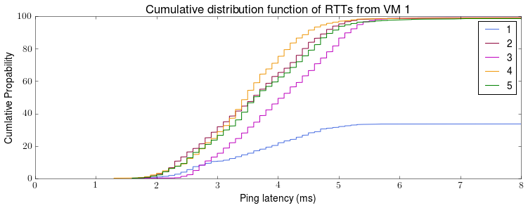
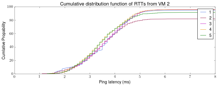
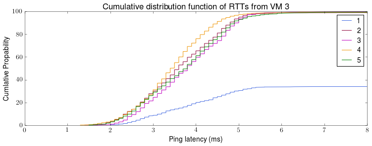
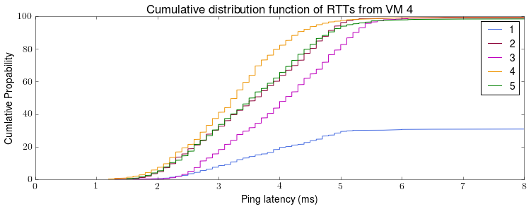
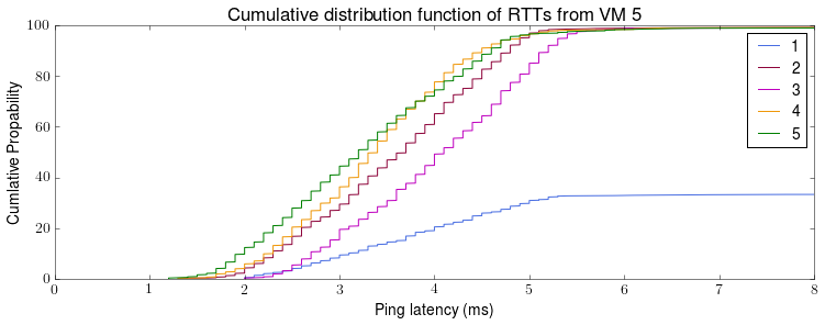
Machine 1 is a clear outlier from the perspective for machines 1, 3, 4 and 5. The observed RTT doesn’t seems to be symmetric. Again this asymmetry warrants further investigation. The stepping in the CDFs is because the RTT is recorded to the nearest 1 decimal place.
Next time, we will look at how the observed RTT varies with time.