So far in this study, we have only considered the aggregated measurements and how they vary depending on the VMs used. In this post, we will considered how the RTT measurements may have changed over time.
The following 5 plots show the RTT as observed by each machine over time. The y axis stops as 12 ms to aid visibility of the majority of results. Using the CDF of all results from the second part in this series, we can see that these figures thus include around 85% of all data points.
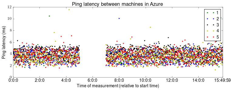
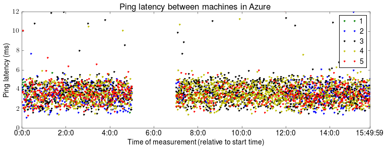
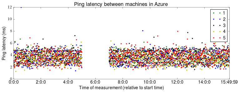
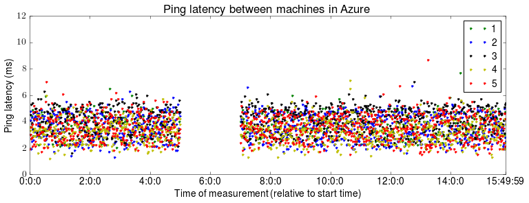
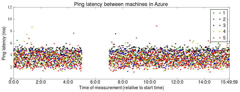
The most striking aspect of these figures is the 2 hour gap in the results. The source of this failure is still unknown. Azure reported no machine or network failures during this time and the system removed and continued to take measurements without any manual intervention. Otherwise, between 2 and 5 ms the RTT measurements appear to be fairly randomly distributed, although as we saw last time their distribution approximates normal (as we would expect).
Overall, I am not particularly happy with the results collected so far and hope the next round of tests will generate better results. Tomorrow, we will compare how these results differ from other studies.